Tag Archives: infrastructure

Detroit

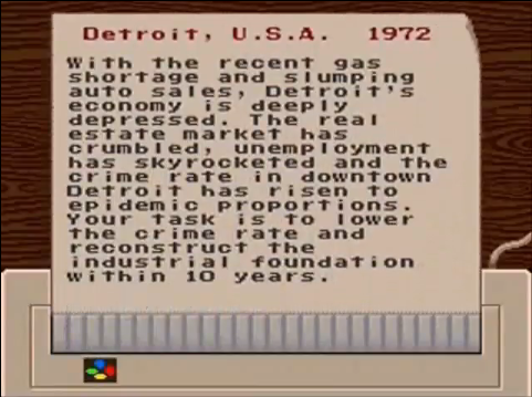
In the original Sim City there were these scenarios that you could play. You were given a city and problem to solve. San Francisco 1906? Earthquake. (Remember, in the even of a major disaster, you may need to be self sufficient for up to 72 hours. Are you prepared? I’m not.) Tokyo 1961? Monster. You get the picture. They were all fairly straight forward, except one. Detroit 1972. Problem? Well… Detroit.

It’s become a contemporary American past time to bash Detroit. I’m not looking to do that. All I will say that I’ve been to Detroit, and it’s the only place I’ve been where the nightlife was in suburbs instead of the city, and peeking over the sound barriers on the freeway never revealed a nice part of town. It’s clearly a city that has seen better days, and has earned its distinction of being a “donut city.”

Its historic buildings are either falling apart, or are being looted for new development elsewhere.

Detroit’s population has steadily shrank since the 1970s, but it still rated as the 11th most populous city, just between San Jose and San Francisco. Unsurprisingly, the city hasn’t depopulated in a controlled manner, so there population is spread thin across the 139 square mile city. This means that Detroit has to maintain an infrastructure for the population 2 million, when less than a million actually use. 40% of the city is fallow. (Of course, this isn’t Detroit’s only problem.)

For years now, one proposed solution to this problem has been to shrink the city. Unoccupied buildings would be condemned, occupied ones bought, and the population relocated closer to downtown. A more controlled Devil’s Night, if you will. Surprisingly, the talk turned serious last year, with the mayor proposing to shrink the city by a fourth.

Today, they started.

Will it work? In 1961, Jane Jacobs described the city as being “largely composed, today, of seemingly endless square miles of low-density failure.” If that’s true, then there’s no core to build around.

Good luck Detroit.

Diaspora

I ditched Facebook. I’ve grew tired of:

  1. RSS feeds not updating.
  2. Being frequently mysteriously logged out
  3. Having applications being added just for accidentally clicking on a damn Farmville-esque wall post.
  4. Being straight, and yet being served ads for gay dating sites.
  5. Applications getting all your information.
  6. Seemingly,. everyone getting your information.
  7. Being tracked.

Facebook always gave me that shit tasted walled garden feeling of the late 90s. I hated how it how it seemed that more and and more techsavy people actually used it to send messages, rather than – you know – email. I like that status updates. I liked that sharing of links, but when I visted CNN.com after viewing Facebook, and seeing my friends’ activity on CNN, I flipped. There’s no reason why that information should be shared. I don’t think I got one of those damn pushed malware apps from Facebook, but I don’t know. Sure, I could have just configured some firewall to block a bunch of stuff, but voting with my feet is much more satisfying.

Still, I like the social aspect. I am going to miss Mike and Lisa‘s comments. I really will. I like the sharing, but I want an archive of my activity. I want control. What should I do?

Enter Diaspora.

Continue reading

Bay Bridge Arcology


With the Bay Bridge, seemingly always in the news*, the question is becoming, what to do with the old eastern span? (You remember the eastern span, don’t you?) Current plans are to simply demolish it, but architects Ronald Rael and Virginia San Fratello has proposed something different. They wants to convert it into a housing and a park.

He calls his proposal, “The Bay Line,” is a combination of the Florence’s Ponte Vecchio and New York’s High Line. The upper deck would be converted into a greenway, while the lower deck (originally designed for freight trains) would contain commercial and residential spaces. Since the deck can support much weight than a typical home, additional space can be hung directly underneath the bridge.

Rael’s graduate studio, have come up with other similar ideas, but they’re all essentially the same thing.

It’s an interesting idea, but I do have some concerns. First, there’s going to be another earthquake. There just will be. So why would you want to be suspended a couple of hundred feet above the water, in a box that has been bolted onto a structure that is over 70 years, that is literally falling apart. (Well at least it’s not as bad as the old Cape Girardeau bridge. Yet.) Rael points out most of the damage back in 1989 was on the approach, not the cantilevers, but I still have my doubts. My other concern is that it’s right next to new bridge. Which means, you’re living right next to a freeway, and that’s got to ruin your view.

But really, I’d just be happy if they name the eastern span the “Emperor Norton I Span”, but Oaklanders are such killjoys.


*Nifty closeups of the recent repairs.

Guerrilla Public Service

After the Camden council in London removed all the park benches because bums were sleeping on them, self proclaimed anarchists, The Space Hijackers, wearing bright yellow vests installed new ones in broad daylight.

This story reminds of LA artist, Richard Ankrom, creating his own perfect facsimile Caltrans sign to label an exit to I-5 back in 2001. The sign is still there; hanging on gantry 23100, on the northbound state route 110, just before the 3rd St. overpass.

Recovery.gov has a Logo

Obama unveiled logos for recovery.gov and the Department of Transportation’s TIGER project. The logos designed by Mode Project. The logos not only represent the economic recovery program, but will be affixed to projects that have been funded though the American Recovery and Reinvestment Act.

The idea of affixing logos to the projects that are receiving ARRA funds reminds me of the blue eagle from the New Deal’s National Recovery Administration.

The eagle was displayed in the windows of businesses that agreed to economic restrictions such as a minimum wage, maximum work hours, and minimum price laws.

I like the idea of clearly marking how the money is being spent. Not only does it promote accountability (assuming of course that the logos are properly affixed), but also highlights just where tax money is being spent. Too often people complain that they never see where their tax money is going. That’s because it’s spread out and in the background. It’s road, the police, the fire truck, the post office, and the school. Perhaps it’s naïve, but maybe seeing a logo will promote an idea of community. I don’t know.

The unveiling of the recovery.gov logo, caused me to notice that TARP doesn’t have a logo. Perhaps one of these could be displayed on doors of and ATMs of Citi and AIG.

hooverflag tarp moneybag tarp logo

via Swiss Miss