Tag Archives: typography

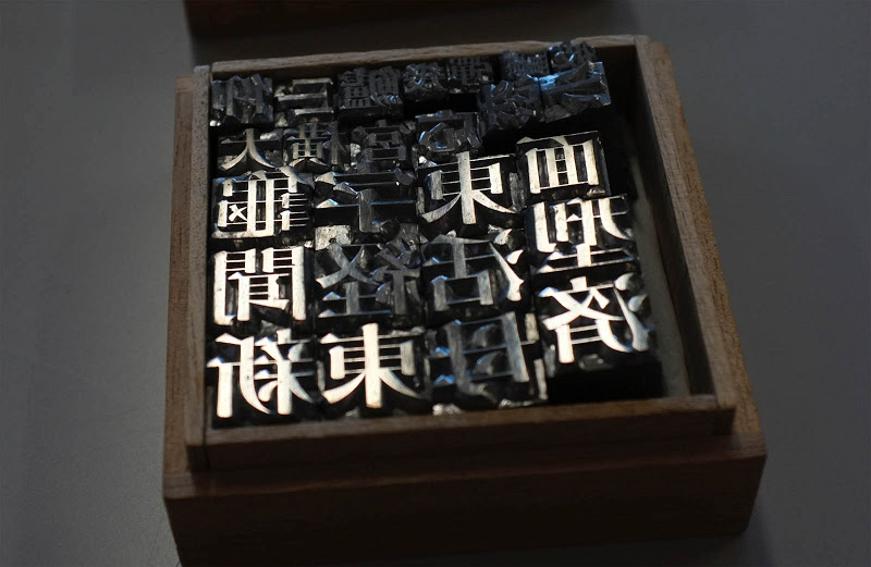
Lead Type

I’m a sucker for movable type. (The lead blocks, not the software, I have no opinion on the software.) The idea of assembling little blocks to make words and sentences makes my heart flutter. I don’t know why. I guess it’s sort of like legos. I love the large trays holding the letters, and I particularly like how the bins are different sizes depending on the character distribution of the language. As I read about how movable type was used and evolved over the years, I gained a greater appreciation of typography. Ligatures, kerning, why periods go inside quotation marks, and why it’s as irrelevant today as the creation MLA’s parenthetical citations 30 years ago.

I don’t think I would have the patience to use movable type. Laser printing is just too easy, and hot metal typesetting seems like cheating. Although in the world where movable type was common, U certainly would have used it instead of carving individual presses for every page.

via Dark Roasted Blend: Intricate Japanese Movable Type Sets

Brand New Hates Helvetica

This reminds me of Paula Scher in Helvetica saying that Helvetica was the font of the Vietnam War.

Why I hate Helvetica

As it concerns identity design we all recognize Helvetica as a bastion of the rise of the practice of corporate identity in the 1960s, deployed with unrelenting passion by the likes of Massimo Vignelli and Unimark in the U.S. and Total Design in Europe. It helped shed decorative logos and present a unified front for corporations of all sizes in the most serious of manners. It was, in a way, a unifying technology of the era, establishing a specific standard for how logos should look. And that’s my biggest issue with Helvetica: It’s 1960s technology, 1960s aesthetics, 1960s principles. You know what else is technology from the 1960s? Rotary-dial telephones. The BASIC computer language. Things we’ve built on for the past 50 years and stopped using as the new, more functional, more era-appropriate products took hold. Today there are dozens of contemporary sans serif typefaces that improve the performance and aesthetics of Helvetica but yet some designers still hold on to it as if it were the ultimate typeface. It’s not. Just because it’s been glorified in a similar way as the suits and clothing in Mad Men doesn’t mean it’s still the right choice. You don’t see people today dressed like Don Draper or Lane Pryce — the business-person equivalents of a business typeface — because fashion has changed, attitudes have changed, the world has changed. But, like cockroaches, Helvetica seems to be poised to survive time and space, no matter what. When you see someone walking down the street, today, dressed like a 1960s business person, you (or at least I) think “what a douche.” That’s the same thought I have when I see something/someone using Helvetica.

The main argument of using Helvetica is that it’s “neutral.” That is absolute bullshit. There is nothing neutral about Helvetica. Choosing Helvetica has as much meaning and carries as many connotations as choosing any other typeface. It has as many visual quirks as any other typeface it was meant to shun for needless decoration. Helvetica is the fixed-gear bike of typefaces: it’s as basic as it gets, but the statement it makes is as complex as anything else. Standing for independence and going against the grain, supposedly not caring about what others think or of being duped for the upgrades and improvements that “the man” forces upon us. Helvetica is old. Helvetica is clunky. No business, service, or product deserves Helvetica in the twenty-first century more than anyone deserves to sit in a dentist chair in the 1960s.

I agree that it’s absurd to say that Helvetica is “neutral” since nothing is truly neutral, especially given its history as essentially the stylish least-common denominator. The politically correct font if you will. I also agree that fetishizing the past is lazy. Max Miedinger and Eduard Hoffmann aren’t some sort of demigods. However, there’s something ironic and a bit pathetic about wanting modernity and advancement in typography of all things. It’s a field that’s based on copying or slightly tweaking existing work. Helvetica? 1896’s Akazidenz Grotesk. Garamond is from the mid 16th century. Some serif fonts can trace their lineage back to illuminated manuscripts, so claiming that designers shouldn’t use a 50 year old font because it’s dated falls flat.

@

MoMA’s Department of Architecture and Design has acquired the @ symbol into its collection. It is a momentous, elating acquisition that makes us all proud.

Wha?

[The acquisition of @] relies on the assumption that physical possession of an object as a requirement for an acquisition is no longer necessary, and therefore it sets curators free to tag the world and acknowledge things that “cannot be had”—because they are too big (buildings, Boeing 747’s, satellites), or because they are in the air and belong to everybody and to no one, like the @—as art objects befitting MoMA’s collection. The same criteria of quality, relevance, and overall excellence shared by all objects in MoMA’s collection also apply to these entities.

No. Stop. A building, a Boeing 747, and a satellite are all physical objects. All of them can be owned. They are bought and sold everyday. In fact, not only are they bought and sold, but buildings, 747s, and yes, even satellites are currently exhibited as museum pieces. Physical objects are the traditional things museums obtain. MoMA draws a connection to their acquisition of Tino Sehgal’s The Kiss, a dance. This would be purchasing intellectual property. While I may not always agree with legalities, or even the intellectual underpinnings, of all intellectual property rules and laws, I understand them. This however, is nonsense.

MoMA says that they “have acquired the design act in itself,” which is a meaningless statement. Sure it sounds good, but what exactly does this mean? They “acquired” the moment that someone created the a-d ligature? The moment that Spanish speaker said, “Hey, this looks like both an ‘a’ and an ‘o’.” The moment Ray Tomlinson decided to use ‘@’ as a delimiter?

Fine. They want to have an exhibit about the at symbol. That’s cool. It might even be interesting. Couching your announcement in terms of purchasing and transactions is absurd. Words have meanings, and as Inigo Montoya told Vizzini, “You keep using that word. I do not think it means what you think it means.”