Tag Archives: maps

Forbidden Zones

Slate’s Vault highlights a 1955 map of forbidden areas for Soviet travelers. Like all good things from the Cold War, it’s born out the absurdity, childish tit-for-tat, and fear.

In 1952, the US passed a law baring pinkos from entering the country. The next year, the Soviets decided to how much better they were by letting capitalist pig dogs into the 70% of Soviet Union. So in 1955, the US decided to mimic the Soviet travel restrictions by opening up 70% of the US and 70% of cities of population greater than 100,000 to the Soviets. Ports and military installations were forbidden, but must of it is just arbitrary nonsense. You can visit Minneapolis, but not St. Paul. KCK is fine, but KCMO is not. Also, don’t even think about leaving Kansas City, Kansas. Texas Panhandle? Not a chance. And don’t even think about visiting Southern Illinois.

It’s just stupid.

This map held until Kennedy removed all travel restrictions in 1962.

The Most Remote Places on Earth

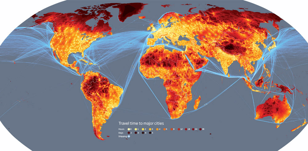
New Scientist links to the European Commission’s Joint Research Centre’s Global Urbanisation and Accessibility Map – part of the World Bank’s 2009 World Development Report. The maps is made by plotting the estimated travel time to a “major” city. They conclude that only 10% of the world is more than 48 hours from a city. Primarily the most remote places are the poles, southern Venezuela, and central Tibet. Even the Sahara is comparatively more accessible.

via Telstar Logistics

The Facebook Map

Paul Butler’s Facebook friend visualization has been going around the intertubes recently. He says:

Not only were continents visible, certain international borders were apparent as well. What really struck me, though, was knowing that the lines didn’t represent coasts or rivers or political borders, but real human relationships. Each line might represent a friendship made while travelling, a family member abroad, or an old college friend pulled away by the various forces of life.

While it is true that’s what the arcs represent “friends”, but the image is informed by the geographic coordinates of the planet. What I find interesting isn’t what his visualization shows, but what it doesn’t show.

Here’s what I found.
Continue reading

Forma Urbis Cairo

BLDGBLOG writes about Nina Burleigh’s book about the French in Egypt during Napoleon, Mirage. In it, Burleigh mentions how each neighborhood in Cairo was walled off from each other. Only small gates, sometimes, just a single gate for a neighborhood interconnected the city. A city of cities if you will. Napoleon ordered that the entire city be mapped.

[I]t was deemed so daunting that at first the engineers hoped the order [to map Cairo] would be rescinded” – but, of course, “it was not.” Edme-François Jomard, the cartographer in charge of the project, wrote: “The city is almost entirely composed of very short streets and twisting alleys, with innumerable dead-ends. Each of these sections is closed by a gate, which the inhabitants open when they wish; as a result the interior of Cairo is very difficult to know.” Jomard, Burleigh writes, would spend his time “knocking on gates that hid whole neighborhoods.”

When I read this, I thought of two things. First, it sounds like 18th century Cairo was almost like Harry Potter’s Diagon Alley. Only if you knew where you were going, and knew the password, would the hidden areas be open to you. The other was the Forma Urbis Romae.

The Forma Urbis Romane was an detailed marble map of Rome circa 200 CE. It outlined every street, alley, doorway, and stairwell in the city. Not just public areas, but the internal plans to the buildings as well. Unfortunately, a majority of the map was destroyed and used for lime and other building materials. Today, only about 10% remains.

I’ve always had a soft sport of maps every since I was little. Whether the map was a real location, or a fictional one, a map always filled me with wonder. It was a window to an adventure. With a map, I’m prepared to go.