Category Archives: illustration
Birthday Distribution

Using census data, the New York Times posted a table of birthday distributions in the United States for people born between 1973 and 1999. The Daily Viz then turned the table into a heatmap with the colors indicating the order of the birthdays, not their likelihoods. If you look at number of births in each month, or number of births per day in each month, the results are much flatter. Still the bias towards the summer shows up.
I’m not surprised that birthdays aren’t uniformly distributed. I am a bit surprised that they’re biased towards the summer though. I would have thought that any bias that long cold nights brought, would have long disappeared with the advent of artificial lights, heat, and a move from an agrarian economy. I’d also like to see a similar charts for other countries. I suspect that if the bias is towards summer months, we’d see a six month shift in southern hemisphere nations.
Brand New Hates Helvetica
This reminds me of Paula Scher in Helvetica saying that Helvetica was the font of the Vietnam War.
As it concerns identity design we all recognize Helvetica as a bastion of the rise of the practice of corporate identity in the 1960s, deployed with unrelenting passion by the likes of Massimo Vignelli and Unimark in the U.S. and Total Design in Europe. It helped shed decorative logos and present a unified front for corporations of all sizes in the most serious of manners. It was, in a way, a unifying technology of the era, establishing a specific standard for how logos should look. And that’s my biggest issue with Helvetica: It’s 1960s technology, 1960s aesthetics, 1960s principles. You know what else is technology from the 1960s? Rotary-dial telephones. The BASIC computer language. Things we’ve built on for the past 50 years and stopped using as the new, more functional, more era-appropriate products took hold. Today there are dozens of contemporary sans serif typefaces that improve the performance and aesthetics of Helvetica but yet some designers still hold on to it as if it were the ultimate typeface. It’s not. Just because it’s been glorified in a similar way as the suits and clothing in Mad Men doesn’t mean it’s still the right choice. You don’t see people today dressed like Don Draper or Lane Pryce — the business-person equivalents of a business typeface — because fashion has changed, attitudes have changed, the world has changed. But, like cockroaches, Helvetica seems to be poised to survive time and space, no matter what. When you see someone walking down the street, today, dressed like a 1960s business person, you (or at least I) think “what a douche.” That’s the same thought I have when I see something/someone using Helvetica.
The main argument of using Helvetica is that it’s “neutral.” That is absolute bullshit. There is nothing neutral about Helvetica. Choosing Helvetica has as much meaning and carries as many connotations as choosing any other typeface. It has as many visual quirks as any other typeface it was meant to shun for needless decoration. Helvetica is the fixed-gear bike of typefaces: it’s as basic as it gets, but the statement it makes is as complex as anything else. Standing for independence and going against the grain, supposedly not caring about what others think or of being duped for the upgrades and improvements that “the man” forces upon us. Helvetica is old. Helvetica is clunky. No business, service, or product deserves Helvetica in the twenty-first century more than anyone deserves to sit in a dentist chair in the 1960s.
I agree that it’s absurd to say that Helvetica is “neutral” since nothing is truly neutral, especially given its history as essentially the stylish least-common denominator. The politically correct font if you will. I also agree that fetishizing the past is lazy. Max Miedinger and Eduard Hoffmann aren’t some sort of demigods. However, there’s something ironic and a bit pathetic about wanting modernity and advancement in typography of all things. It’s a field that’s based on copying or slightly tweaking existing work. Helvetica? 1896’s Akazidenz Grotesk. Garamond is from the mid 16th century. Some serif fonts can trace their lineage back to illuminated manuscripts, so claiming that designers shouldn’t use a 50 year old font because it’s dated falls flat.
Threadless Wishlist

When Pandas Attack
I actually saw this shirt (only it was green I think) in Beijing in a little shop. I should have bought it, assuming it was in my size.
Nintendo Ukiyo-e

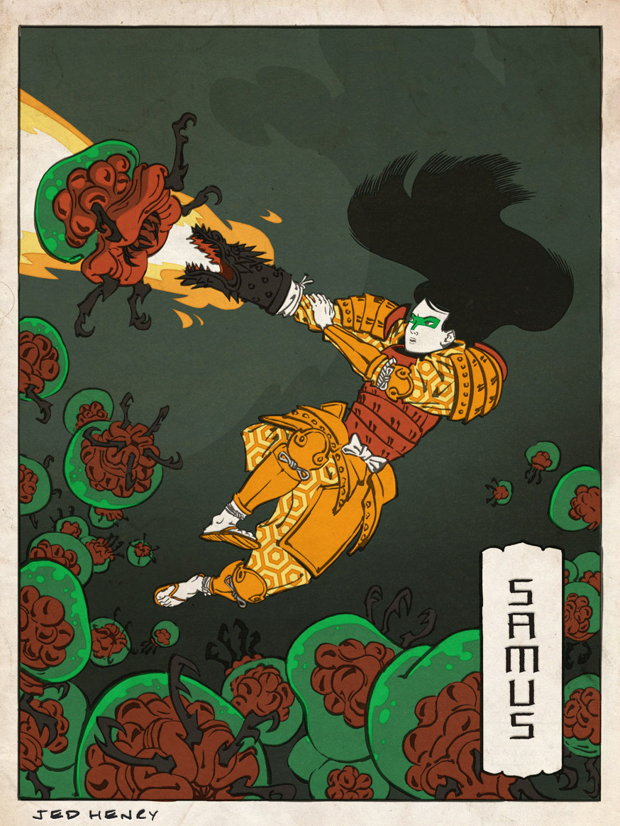
Illustrator Jed Henry has drawn several Nintendo characters in the style of Ukiyo-e woodblock prints. It’s a bit kitsch, but his original work isn’t bad. It reminds of an “I am 8 bit” exhibition.
Sorry About the IPO
“Whoa. This is Heavy”

Voynich Manuscript

A few of years ago or so I became interested in the art of grimoires. The woodcuts of regular geometric shapes overlaid over demons or simply naked people. Codes. Magic. Dark conspiracies. Grimoires have it all.
The ultimate book of magic is the enigmatic Voynich Manuscript. Discovered in 1912 in an antique bookshop, its authorship and meaning has never been clear. Written sometime between 1404 and 1438, its drawing appear to describe plants, biology, cosmology, and medicine. The text is either some sort of encryption, or maybe even meaningless asemic text.
I first heard of the Voynich Manuscript overhearing a rather bizarre conversation between two older gentlemen at Sureshot coffee in Seattle the summer of 2008. One man was discussing some occult conspiracy of an that involved the Voynich Manuscript, an medieval immortality cult of serial killers, and the Zodiac Killer. I think Bohemian Grove entered in to it as well.


