Author Archives: jonathan

Birthday Distribution

Using census data, the New York Times posted a table of birthday distributions in the United States for people born between 1973 and 1999. The Daily Viz then turned the table into a heatmap with the colors indicating the order of the birthdays, not their likelihoods. If you look at number of births in each month, or number of births per day in each month, the results are much flatter. Still the bias towards the summer shows up.

I’m not surprised that birthdays aren’t uniformly distributed. I am a bit surprised that they’re biased towards the summer though. I would have thought that any bias that long cold nights brought, would have long disappeared with the advent of artificial lights, heat, and a move from an agrarian economy. I’d also like to see a similar charts for other countries. I suspect that if the bias is towards summer months, we’d see a six month shift in southern hemisphere nations.

Brand New Hates Helvetica

This reminds me of Paula Scher in Helvetica saying that Helvetica was the font of the Vietnam War.

Why I hate Helvetica

As it concerns identity design we all recognize Helvetica as a bastion of the rise of the practice of corporate identity in the 1960s, deployed with unrelenting passion by the likes of Massimo Vignelli and Unimark in the U.S. and Total Design in Europe. It helped shed decorative logos and present a unified front for corporations of all sizes in the most serious of manners. It was, in a way, a unifying technology of the era, establishing a specific standard for how logos should look. And that’s my biggest issue with Helvetica: It’s 1960s technology, 1960s aesthetics, 1960s principles. You know what else is technology from the 1960s? Rotary-dial telephones. The BASIC computer language. Things we’ve built on for the past 50 years and stopped using as the new, more functional, more era-appropriate products took hold. Today there are dozens of contemporary sans serif typefaces that improve the performance and aesthetics of Helvetica but yet some designers still hold on to it as if it were the ultimate typeface. It’s not. Just because it’s been glorified in a similar way as the suits and clothing in Mad Men doesn’t mean it’s still the right choice. You don’t see people today dressed like Don Draper or Lane Pryce — the business-person equivalents of a business typeface — because fashion has changed, attitudes have changed, the world has changed. But, like cockroaches, Helvetica seems to be poised to survive time and space, no matter what. When you see someone walking down the street, today, dressed like a 1960s business person, you (or at least I) think “what a douche.” That’s the same thought I have when I see something/someone using Helvetica.

The main argument of using Helvetica is that it’s “neutral.” That is absolute bullshit. There is nothing neutral about Helvetica. Choosing Helvetica has as much meaning and carries as many connotations as choosing any other typeface. It has as many visual quirks as any other typeface it was meant to shun for needless decoration. Helvetica is the fixed-gear bike of typefaces: it’s as basic as it gets, but the statement it makes is as complex as anything else. Standing for independence and going against the grain, supposedly not caring about what others think or of being duped for the upgrades and improvements that “the man” forces upon us. Helvetica is old. Helvetica is clunky. No business, service, or product deserves Helvetica in the twenty-first century more than anyone deserves to sit in a dentist chair in the 1960s.

I agree that it’s absurd to say that Helvetica is “neutral” since nothing is truly neutral, especially given its history as essentially the stylish least-common denominator. The politically correct font if you will. I also agree that fetishizing the past is lazy. Max Miedinger and Eduard Hoffmann aren’t some sort of demigods. However, there’s something ironic and a bit pathetic about wanting modernity and advancement in typography of all things. It’s a field that’s based on copying or slightly tweaking existing work. Helvetica? 1896’s Akazidenz Grotesk. Garamond is from the mid 16th century. Some serif fonts can trace their lineage back to illuminated manuscripts, so claiming that designers shouldn’t use a 50 year old font because it’s dated falls flat.

iDesk

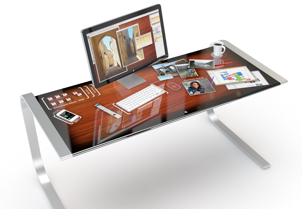
Mac|Life’s concept iDesk seems plausible and very expensive. In their concept, Mac|Life images a desk with a multitouch display and bluetooth connectivity. Phones, laptops, and other devices when placed on the desk can have their data accessed and transferred though on desk icons.

It’s a striking design, having your desk be one giant interactive flat panel display. The technology to do this certainly seems ready. Giant retina displays, and multitouch controls exist. (Well retina displays exist, scaling them up to 6 feet by 4 feet, maybe not.) The real problem seems to be more of software rather than hardware. You don’t even really need one display like that. Simply more intuitive graphical and tactile syncing with current separate displays would be nice. I imagine transferring documents from desktop or laptop computer to a tablet by touching the screen displaying the document with spread open fingertips, making a fist (think grabbing) and then touching the screen of the destination device. Of course thinking of local device storage is so 20th century. Everything is going cloud with continuous syncing.

More Microbrial Home

After coming across the Bio-Light, I felt I needed to highlight a few other projects in Philips’s Microbrial Home.

According to Philips, the centerpiece of the home is a kitchen island with an integrated bioreactor. The digester is connected to the garbage disposal so that decaying plant and animal matter can be fed to bacteria that then produces methane which is then burned for fuel. It’s an interesting idea, but I find it hard to believe that the the amount of energy created from the scraped plates of a few dinners could actually do anything useful, certainly not anything that could noticeably effect the power demands of the home.

The main purpose of the bioreactor – besides fueling the Bio-Light – is to power the the dining table. An herb garden grows above a table that has integrated terra cotta evaporation coolers. What’s the methane for, apparently to warm the tabletop. Strange I know. Still, the table does look pretty striking with plants and the storage.

Continue reading

Bio-Light

Part of Philips’s Microbial Home concept, the Bio-Light is a group glass vessels containing a bioluminescent bacteria. The bacteria is suspended in a nutrient bath that is provided from either a biodigester, or just a boring old tank.

Seeing the photos of the lamp, I wondered how much light was actually generated. I still don’t know. I don’t expect the Bio-Light to be useful to read by or anything, but I would expect it to be bright enough to be obviously glowing even in a room that’s moderately lit. Looking into bioluminescent kits, the bacteria in the lamp might be vibrio fischeri. Bacteria isn’t a bad choice for bioluminescent lamps since unlike diatoms, they glow continuously, as opposed to only when disturbed. Another possibility would be to use fungi like armillariella mellea (aka foxfire), but from what I’ve read most fungi are very dim. Mycena chlorophos might be a bit brighter, but Im having problems finding where to purchase it. Personally, I’d feel better having a bunch of mushrooms on my wall rather than bacteria.

Previously. Previously

Continue reading

Plant-In City

Designed by Huy Bui, Jon Schramm of HB Collaborative and Carlo Gómez de Llarena have designed a set of interlocking cedar boxes to create an automated terrarium. Called Plant-In City, they are currently running a Kickstarter Campaign to gather funding to finish prototypes and to ramp up production.

The system consists of three different cedar frames. The main frame is the “light frame”, and features LEDs mounted along the top rectangle. A “soil” frame a simple box that contains dirt along with sensors to monitor light, humidity and moisture. The last frame is the “water frame” and it is made up of a water tank along with tubing and a solenoid valve to control water flow. The sensors, lights, and valves are connected to an arduino that wirelessly connects to the Internet. Through either the Plant-It City website or mobile app, owners can monitor and control their frames via cosm.com‘s API. The sensors not only alert the owner to changes in the terrarium, but also are used to drive an audio and visual effects for in-person visitors of the system.

Previously.

Continue reading