You’ve seen the show, now own the tattoo.

You’ve seen the show, now own the tattoo.


It looks good. It looks modern. The only problem I have with the design is that big freakin’ blue stripe down the middle.
Compared to the $5 unveiling in 2007, the video for the new $100 bill, it’s well produced. The music. The animation. The design of the bill, all says modern, says 21st Century. It’s down right patriotic. Honestly, when I see the difference between these videos (and the 2007 video is down right embarrassingly bad) and and the change in administrations, I think it’s intentional. The government runs poorly under conservatives, because they want to say the government does a bad job. Just like how health, safety, tax, and other regulatory enforcement goes down under these “law an order” administrations, because they don’t like the law, but don’t want to be put on the spot arguing for say, more arsenic in drinking water. But I digress.
The color is tasteful. While it’s bolder than the post-2003 $20, $50, $10, and $5, it’s still predominately green, and still looks American. I really like the color shifting liberty bell in the inkwell. While the microlenses in the blue stripe are interesting, that strip is just horrible. It looks like someone forgot to take a plastic wrapper off of it or something.
I would love to see every bill similarly redesigned. And while I understand, that printing new $2 bills is somewhat sporadic due to concerns of flooding the market with them, (Last printed September 2006.) I’d still love to see a new $2 bill and a new $1 bill. It irks me to no end that, that the last time I had a wallet containing American currency with a consistent look was 1999.
What would the other bills look like? Would the color of the portrait’s face, and low-vision numerals change? Would the background image and inkwell and liberty bell to somehow reflect on the person pictured? If so, what would they be? I want all these questions answered. Damnit, bitch. Give me my money! ;)

Like many people, growing up, my family used to decorate Easter eggs, Only our eggs tended to be decorated like Ukrainian Easter eggs, or pysanky. My mom learned how to do this from a friend of hers, that truly an artist at it. Every year, we’d break out the beeswax candle, heat our styluses and attempt to draw deer or weave patterns, dots, or crosses on the eggs. Some years, we’d even bring out a hypodermic needle and a syringe and extract the yolks so we could keep the eggs for years.
I decided that I wanted to decorate eggs this year, but all we had was the crayon and dye that’s in a Paas kit, and the new dye containing cotton swabs. (Using the swabs are pretty fun.)
I pretty much resigned myself to not decorating eggs with candle wax for many many years, since I had no idea where to buy the stuff you need. Then for some unknown reason I checked out Make’s Top 10 Easter Themed Posts. In the list was a Ukrainian easter eggs. Following a couple of more links, I found out that that The Caning Shop in Berkeley sells everything. Hooray! Surprisingly, the book about how to make the designs my mom has had all my life is still in print.

MoMA’s Department of Architecture and Design has acquired the @ symbol into its collection. It is a momentous, elating acquisition that makes us all proud.
Wha?
[The acquisition of @] relies on the assumption that physical possession of an object as a requirement for an acquisition is no longer necessary, and therefore it sets curators free to tag the world and acknowledge things that “cannot be hadâ€â€”because they are too big (buildings, Boeing 747’s, satellites), or because they are in the air and belong to everybody and to no one, like the @—as art objects befitting MoMA’s collection. The same criteria of quality, relevance, and overall excellence shared by all objects in MoMA’s collection also apply to these entities.
No. Stop. A building, a Boeing 747, and a satellite are all physical objects. All of them can be owned. They are bought and sold everyday. In fact, not only are they bought and sold, but buildings, 747s, and yes, even satellites are currently exhibited as museum pieces. Physical objects are the traditional things museums obtain. MoMA draws a connection to their acquisition of Tino Sehgal’s The Kiss, a dance. This would be purchasing intellectual property. While I may not always agree with legalities, or even the intellectual underpinnings, of all intellectual property rules and laws, I understand them. This however, is nonsense.
MoMA says that they “have acquired the design act in itself,” which is a meaningless statement. Sure it sounds good, but what exactly does this mean? They “acquired” the moment that someone created the a-d ligature? The moment that Spanish speaker said, “Hey, this looks like both an ‘a’ and an ‘o’.” The moment Ray Tomlinson decided to use ‘@’ as a delimiter?
Fine. They want to have an exhibit about the at symbol. That’s cool. It might even be interesting. Couching your announcement in terms of purchasing and transactions is absurd. Words have meanings, and as Inigo Montoya told Vizzini, “You keep using that word. I do not think it means what you think it means.”

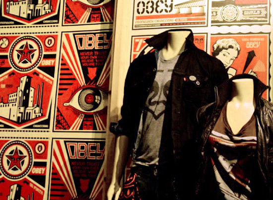
Perhaps Maynard James Keenan would have would take issue with me, but if there was any doubt that Shepard Fairey has sold out, Levi’s hired Fairey to develop a clothing line, complete with a paste up at Times Square, should remove all doubt. The art? Obey Giant in the shape of a jeans pocket, and previously work (“Stay Up Girl” 2004 (Plate 196 in “Supply and Demand”, “Obey Factory” 2000 (Plate 201 ibid), and two others) defaced with Levi’s Giant and Levi’s new slogan, “Go Forth.”
Granted the guy has to pay the bills, and he’s done commercial work before, but there seems like a line is crossed when you’re repurposing your own work for a marketing campaign, especially when your art is has a very strong anti-conformity, anti-establisment, anti-commerical bent to it. Then to top it off, you write:
One of my main concepts with the [“This is Your God” show in 2003 at the Six Space Gallery in Los Angeles] (and the campaign as a whole) was that obedience is the most valuable currency. People rarely consider how much power they sacrifice by blindly following a self-serving corporation’s marketing agenda, and how their spending habits reflect the direction i which they choose to transfer power.
At least the irony of the situation isn’t lost on one of us.
Now if only we can get that damn Carmen Sandiego.
I would pay for that to be put on a t-shirt. Oh good! There might be one.

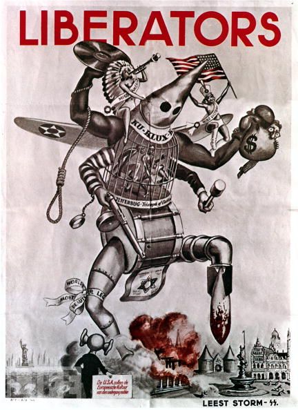
The mind reels that the Nazis would invoke the Klan in an attempt to demonize the US.
Life Magazine is running a selection of WWII propaganda posters, in recognition of the 70th anniversary of the start of the the Second World War.
I’ll admit it, I have a soft spot for the most romanticized period of 20th century. The epic fight of Good versus Evil. The last Good War. The rapid advances of technology. The streamline styling of the era. The Greatest Generation had class and style. (Levittown not withstanding.) It set in motion all the changes of the latter half of the 20th century.
The poster art always really grabbed me. (Such as the Varga Girls, whether on a calendar, or a warplane.) It’s probably one of the most easily recognizable art forms of the era. It’s what initially drew me to Shepard Fairey’s work, until I realized that I had all the original images sitting on my hard drive, and decided he was DJ Fuckface. (Don’t miss the remix!) (Yeah, yeah. I know.)

Last February Chris Bodle Watermarks Project was a series of projections throughout Bristol, England that illustrated high-tide water levels if the Greenland ice shelf would melt.
I really like BLDGBLOG thoughts about this project. How idea of projecting a different geography over the current geography. A kind of public augmented reality.
I would love for something like Watermarks to change people’s attitudes and motivate the radical changes that are needed, but it won’t. We’re doomed, by our own hubris.

BLDGBLOG writes about Nina Burleigh’s book about the French in Egypt during Napoleon, Mirage. In it, Burleigh mentions how each neighborhood in Cairo was walled off from each other. Only small gates, sometimes, just a single gate for a neighborhood interconnected the city. A city of cities if you will. Napoleon ordered that the entire city be mapped.
[I]t was deemed so daunting that at first the engineers hoped the order [to map Cairo] would be rescinded” – but, of course, “it was not.” Edme-François Jomard, the cartographer in charge of the project, wrote: “The city is almost entirely composed of very short streets and twisting alleys, with innumerable dead-ends. Each of these sections is closed by a gate, which the inhabitants open when they wish; as a result the interior of Cairo is very difficult to know.” Jomard, Burleigh writes, would spend his time “knocking on gates that hid whole neighborhoods.”
When I read this, I thought of two things. First, it sounds like 18th century Cairo was almost like Harry Potter’s Diagon Alley. Only if you knew where you were going, and knew the password, would the hidden areas be open to you. The other was the Forma Urbis Romae.
The Forma Urbis Romane was an detailed marble map of Rome circa 200 CE. It outlined every street, alley, doorway, and stairwell in the city. Not just public areas, but the internal plans to the buildings as well. Unfortunately, a majority of the map was destroyed and used for lime and other building materials. Today, only about 10% remains.
I’ve always had a soft sport of maps every since I was little. Whether the map was a real location, or a fictional one, a map always filled me with wonder. It was a window to an adventure. With a map, I’m prepared to go.