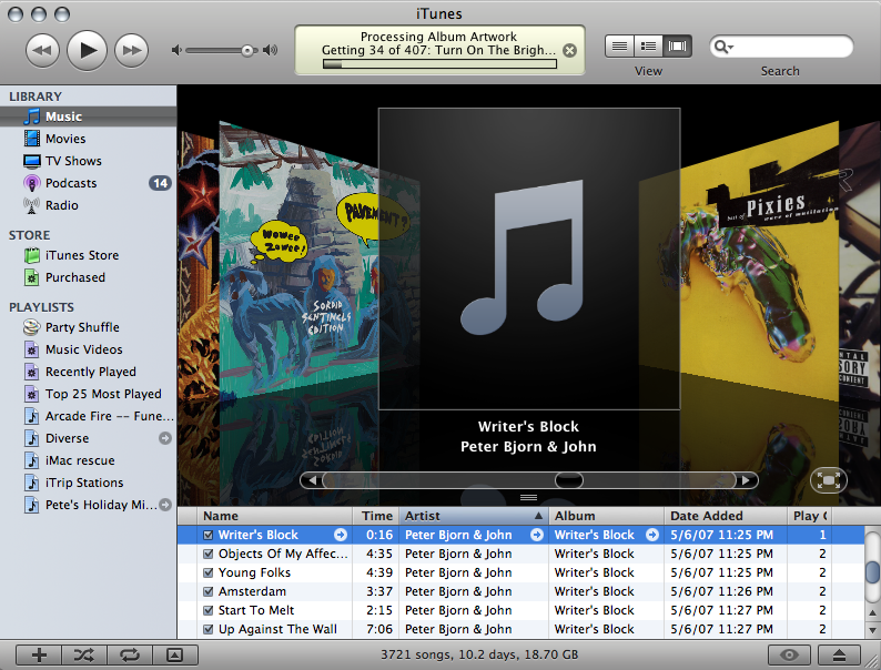
iTunes 10 sucks. There. I said it. I find it infuriatingly difficult to use compared to iTunes 9, for two very simple reasons. First, Apple has once again decided to take a page out of the Linux book, and no longer have all the applications look the same. When MacOSX came out, there were two themes: aqua and metal. This sucked, because quite often if you had two different applications open simultaneously, the user would see two windows that looked very different. It was depressing, and made your desktop look like amateur hour at a Linux User Group meeting. After eight years, and the release of Leopard (MacOSX 10.5), windows finally looked uniform. Well, until “Pro” or whatever Apple is calling the Aperture toolkit theme, came out.
With iTunes 10, Apple has embraced the notion, that for some reason, media players don’t have to look like other applications. (Personally, I blame WinAmp for starting this.) Apple moved the max-min-close buttons for reason. I have no idea why they would do this. It kills all muscle memory on how to use the window manager.
The second thing that makes iTunes 10 needlessly difficult to use, is the purging of all color from the interface. Why? I’m not color blind, why should I be forced to act like I am? The use of color for the sidebar icons made distinguishing among playlist types, libraries, and the like easy, since each icon had one predominant color. Now I have to stare at identically colored, and similarly shaped icons, to find what I want. Again, I have no idea why would do this. This is clearly a step backwards in usability. Seriously, check out this screenshot of iTunes 9, and try to tell me this is worse than iTunes 10.

Don’t even get me started on using the music player to purchase a book and sync it to my tablet.
(Can we just kill “iTunes” and replace it with a new “iMedia”, Steve-O?)