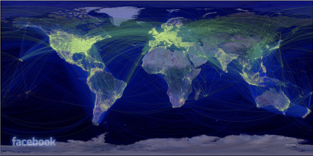
Paul Butler’s Facebook friend visualization has been going around the intertubes recently. He says:
Not only were continents visible, certain international borders were apparent as well. What really struck me, though, was knowing that the lines didn’t represent coasts or rivers or political borders, but real human relationships. Each line might represent a friendship made while travelling, a family member abroad, or an old college friend pulled away by the various forces of life.
While it is true that’s what the arcs represent “friends”, but the image is informed by the geographic coordinates of the planet. What I find interesting isn’t what his visualization shows, but what it doesn’t show.
Here’s what I found.
With the exceptions of Vancouver, Toronto, and Montreal, there don’t appear too many cities in Canada with American friends. The world’s longest undefended border is pretty apparent. Also it appears that Icelanders main non-Icelandic friends are on the Faroe Islands, the Faroese are also friends with the Scots. So if you want that hot date with Bjork and you’re American: make friends with a Scott, who knows Faroese, who knows Bjork. Interestingly (and by “interesting,” I mean “unsurprisingly”), Greenlanders have no friends outside of Greenland. Perhaps they have already taken Bjork’s advice and no one noticed.
One of the comments on the Facebook page said the arcs looked like Aaron Koblin’s “Flight Patterns”. It does, but that wasn’t my initial thought. Mine was NASA’s “Earth at Night”. Why? Because there there are whole regions of the globe that are dark.
I overlaid the Facebook map over the “Earth at Night, and noticed where cities were missing from the World of Facebook. (Click for larger versions.) Unsurprisingly China was missing, as was Russia, but surprisingly so was Brazil. Latvia is noticeably missing from the Baltic States. Other parts of the globe were surprisingly bright, like the west African group of Nigeria, Ghana, and the Ivory Coast(!), and the east African group The Democratic Republic of the Congo, Uganda, and Kenya. The islands of Reunion and Mauritius are two bright jewels off the Malagasy coast.
I next took the commenter’s advice, and next overlaid visualization of airline travel (green arcs) I found on the web. While a noisy image (I had to constantly battle with competing image resolutions, colors, and map projections, during these visualizations), this map effectively showed the economic and real social ties between distant cities. The missing of arcs of China, Russia, and the Middle East became became highlighted. One set of arcs that are missing airline flights, are those coming from Johannesburg.
Of course, Facebook is not the world. In order to be “friends” with someone, both of you need an Internet connection. While the world is becoming increasingly “wired” (often wirelessly in rural parts of the world), the Internet is still not everywhere. To paraphrase William Gibson: the present is already here – it’s just not very evenly distributed.
So where are the data pipes? I overlaid a map of transoceanic data cables from Telegeography. (If I had to do it again, I would have used Telegeography’s Global Traffic Map instead.)
It’s interesting, but it’s not very informative here. The cables run along the shortest paths of globe, exactly as you would expect. So is there a map that explains these regions, especially the surprising (at least to me) bright spots? Yes, there is. GDP density.
What I would love to see from the Facebook data would be pairwise correlations between countries. What pairs of countries of the strongest transnational friendships? How do these correlations correspond with trade between these countries. Are there surprises? (I’m thinking US soldiers serving abroad might show up.) What countries have the most international friends per capita, and which have the least? There’s a research paper (or at least an Ok Cupid like blog post) there, I’d love to read.


Leave a Reply
You must be logged in to post a comment.