Tag Archives: userexperience

iTunes 10 is Full of Fail

iTunes 10 sucks. There. I said it. I find it infuriatingly difficult to use compared to iTunes 9, for two very simple reasons. First, Apple has once again decided to take a page out of the Linux book, and no longer have all the applications look the same. When MacOSX came out, there were two themes: aqua and metal. This sucked, because quite often if you had two different applications open simultaneously, the user would see two windows that looked very different. It was depressing, and made your desktop look like amateur hour at a Linux User Group meeting. After eight years, and the release of Leopard (MacOSX 10.5), windows finally looked uniform. Well, until “Pro” or whatever Apple is calling the Aperture toolkit theme, came out.

With iTunes 10, Apple has embraced the notion, that for some reason, media players don’t have to look like other applications. (Personally, I blame WinAmp for starting this.) Apple moved the max-min-close buttons for reason. I have no idea why they would do this. It kills all muscle memory on how to use the window manager.

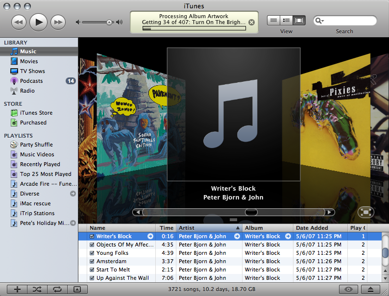
The second thing that makes iTunes 10 needlessly difficult to use, is the purging of all color from the interface. Why? I’m not color blind, why should I be forced to act like I am? The use of color for the sidebar icons made distinguishing among playlist types, libraries, and the like easy, since each icon had one predominant color. Now I have to stare at identically colored, and similarly shaped icons, to find what I want. Again, I have no idea why would do this. This is clearly a step backwards in usability. Seriously, check out this screenshot of iTunes 9, and try to tell me this is worse than iTunes 10.

Don’t even get me started on using the music player to purchase a book and sync it to my tablet.
(Can we just kill “iTunes” and replace it with a new “iMedia”, Steve-O?)

Kin Dead

Wow, just last week I singled out Microsoft Kin as an interesting idea. Yesterday, The Kin died.

Wow. I can really nailed that one. Apparently, the reviews were rather poor for it, in all fairness, I wasn’t thinking much about the phone, just the UI. The visualization of the lifestream was what was interesting, and there’s no reason why this idea can’t be applied to some other product.

Update: Wed Jul 7 15:13:28 PDT 2010
Microsoft sold 503. Ouch. Well I didn’t buy one.

Update: Fri Jul 9 01:28:50 PDT 2010
Thoughts from the guy who killed the Kin.

Shared Artifacts

Schuresko one time mentioned using shared artifacts for collaboration and social network interaction. Instead of simply just clicking buttons in lists, users would manipulate representations of the activities/messages more like how one drags icons around on a desktop. He mentioned OLPC’s Sugar interface, and how other OLPC users show up as icons on the home screen, complete with icons indicating what activity they are currently engaged in. Since many of the OLPC applications are collaborative, clicking on a user’s icon will crate a shared session with him/her. Also, when users are collaborating, their icons appear huddled around the same activity icon.

I hadn’t seen anything like that interface before, especially deployed outside of a lab. I thought about that recently when trying to simply share a folder on my computer with Ming’s was an exercise in frustration. (Either we couldn’t log in to each other’s machines, or the network link would collapse immediately after beginning the transfer.)

Later, I saw an ad for Microsoft’s Kin phone. It interface (shown above, you have to click around on their link unfriendly site to find the video yourself) seems pretty novel. The user is initially presented with a graphical life stream. From this, they can drag items down to the area immediately below the stream (the “Kin Spot”) to share them with people in their address book. Again, destinations are selected from a graphical stream and dragged to the spot. Tapping the spot allows the final message is edited and then sent.

It would be interesting to create an interface like this for Diaspora, if that ever gets off the ground.

Users and Choice

People will often want more information than they can actually process. Having more information makes people feel that they have more choices. Having more choices makes people feel in control. Feeling in control makes people feel they will survive better.

— The Psychologist’s View of UX Design by Susan Weinschenk

versus

Autonomy and Freedom of choice are critical to our well being, and choice is critical to freedom and autonomy. Nonetheless, though modern Americans have more choice than any group of people ever has before, and thus, presumably, more freedom and autonomy, we don’t seem to be benefiting from it psychologically.

— Barry Schwartz, “The Paradox of Choice: Why More Is Less”, 2004, Chapter 5

via Unknown 8 Bit